Pantone’s Nature-Inspired Pick for 2017 Color of the Year
Experience The Woodlands
 By Melissa Dittmann Tracey, REALTOR® Magazine
Adding nature, via plants, has always been a popular way to help spruce up a home for sale. But Pantone’s 2017 choice for Color of the Year wants you using the color of nature in a bolder way in the new year.
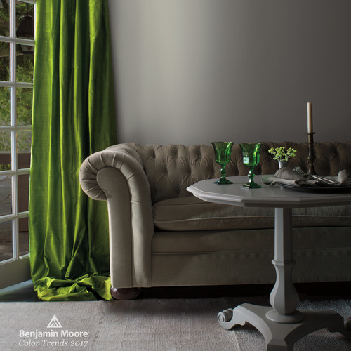
Pantone named Greenery its 2017 Color of the Year. The tangy yellow-green hue offers a pop of color while also aiming to give the illusion of nature indoors, the company states in its announcement. Greenery is a veer from Pantone’s softer color choices last year of Serenity and Rose Quartz.
“Satisfying our growing desire to rejuvenate, revitalize, and unite, Greenery symbolizes the reconnection we seek with nature, one another and a larger purpose,” says Leatrice Elseman, executive director of the Pantone Color Institute.
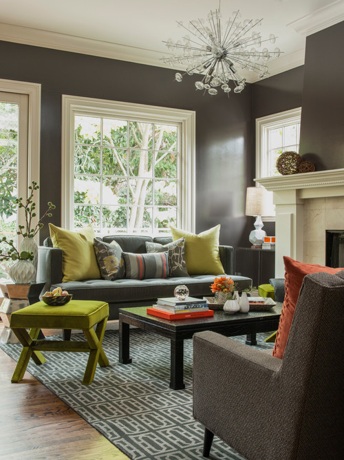
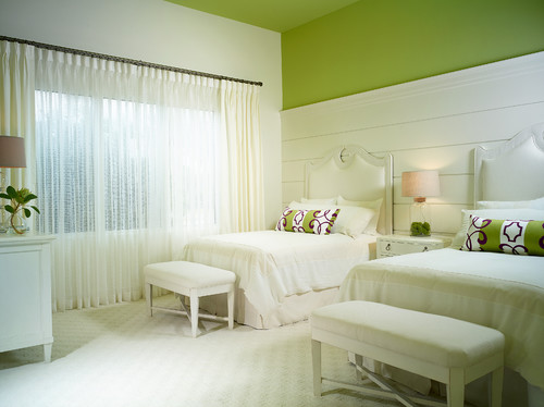
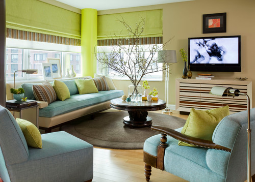
Look for this shade of green to pop up in more home accessories and furnishings in the new year. Some homeowners may take a bolder approach by splashing it on their walls, whether by a vibrant painted accent wall or botanically-themed wallpaper.
Here’s how a few designers have subtly incorporated this shade into their designs below. Tell us what you think of this year’s Color of the Year. Do you plan to use it in your staging?
The post Pantone’s Nature-Inspired Pick for 2017 Color of the Year appeared first on The Woodlands TX.